Feature Cards
File:
sections/feature-cards.liquidTemplates:
index.json
Description
Feature Cards
A grid of feature cards with image, title, and description, used for “Other Ways to Get Involved” or similar call-to-action sections. Cards are rendered via repeatable blocks and support optional links.
Features:
- Configurable background, title, and text colors
- Section title and subtitle with slide-in animations
- 3-column responsive card grid (stacks to 1 column on mobile)
- Each card has an image with hover overlay, title, and rich text description
- Optional card-level links making the entire card clickable
- Intersection Observer-based entrance animations
Settings:
- background_color (color) — Section background color, default #FFFFFF
- title_color (color) — Title text color, default #00746D
- text_color (color) — Body text color, default #22434F
- title (text) — Section title, default “Other Ways to Get Involved”
- subtitle (text) — Section subtitle
Blocks:
- card: A feature card with the following settings:
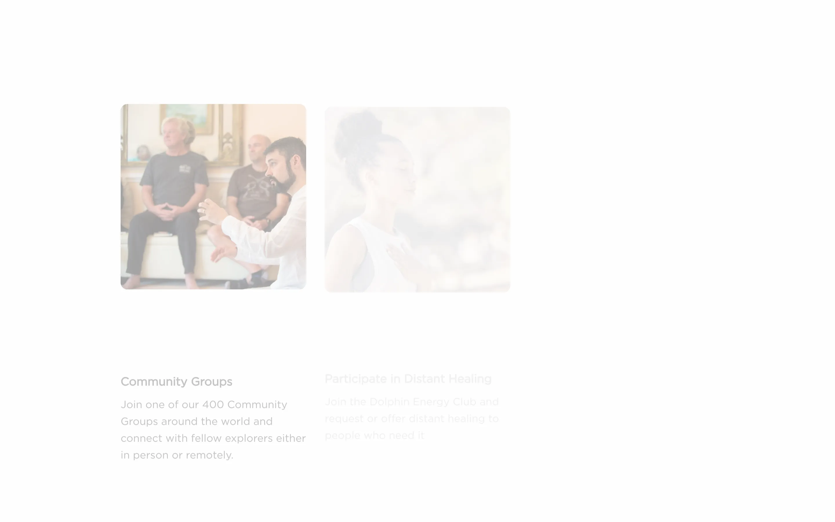
- image (image_picker) — Card image (recommended 600x600px)
- title (text) — Card title
- description (richtext) — Card description
- link (url) — Optional link making the entire card clickable
Snippets Used: None
Dependencies:
- Inline CSS for BEM-style component classes and animations
- Inline JavaScript for Intersection Observer entrance animations
Tailwind Status: None All styling uses custom BEM CSS classes defined in an inline style block.
Settings
| ID | Type | Label | Default | Info |
|---|---|---|---|---|
| “ | header | |||
background_color | color | Background Color | #FFFFFF | |
title_color | color | Title Color | #00746D | |
text_color | color | Text Color | #22434F | |
| “ | header | |||
title | text | Title | Other Ways to Get Involved | |
subtitle | text | Subtitle | Join a Community of Explorers Dedicated to Expanding Awareness |
Blocks
Card
- Type:
card
| ID | Type | Label | Default |
|---|---|---|---|
image | image_picker | Image | |
title | text | Title | Card Title |
description | richtext | Description | <p>Card description goes here.</p> |
link | url | Link (Optional) |
Presets
- Feature Cards
Usage
This section can be added via the Shopify theme editor.
{% section 'feature-cards' %}